
Gym website design Perth: how we built the DFRNT Health and Fitness website.
DFRNT is a Perth gym built on coach led sessions, structured programming and a community that keeps each other accountable. We designed their website, shot the photography and video, and made joining as simple as pressing one button.
DFRNT at a glance.
A gym that does not want to look like every other gym.
DFRNT Health and Fitness is a gym for people who want more from their training. The brand rejects the cookie cutter fitness model. Coaching is personal, programming is purposeful and members hold each other accountable.
Their brief to us was simple: carry that same energy online, show what sets DFRNT apart, and make joining effortless.
The problem to solve
Most gym websites look the same. Stock photos of smiling people, a price list and a contact form. For a gym whose whole point is being different, that would have been a miss.
The site also had to work on a phone. Most people will first find DFRNT on a small screen, so the message, the timetable information and the way to join all had to be clear without any zooming or scrolling around.
The DFRNT website.
What we did for DFRNT.
The website is the centre of the project, with photography, video and marketing built around it so everything looks like one brand.
Built the site around one idea: being different
Rather than lean on stock imagery and generic layouts, we built a bold, confident look that reflects how DFRNT trains and how its members show up. Strong typography, a black and white palette and plenty of space for photography give the site an energy that is unmistakably theirs.
Said what makes DFRNT different, straight away
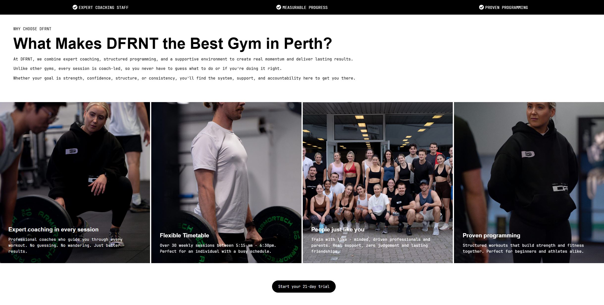
The top of the page lists three proof points: expert coaching staff, measurable progress and proven programming. Below that, four short reasons explain the difference. Every session is coach led, there are over 30 weekly sessions between 5:15 am and 6:30 pm, members are people just like you, and the programming is structured for beginners and athletes alike.
Explained the sessions in plain language
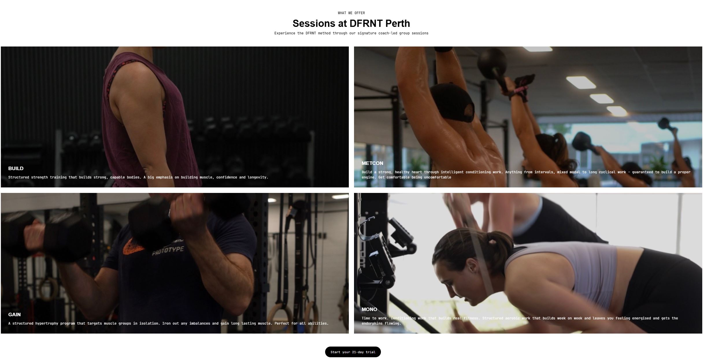
DFRNT runs four signature group sessions: Build, Metcon, Gain and Mono. Each gets a short description of what it is for and who it suits, so a nervous first timer can tell what they would actually be doing before they walk in.
Made joining three steps
Sign up in seconds, chat with the team, start your trial. No ongoing commitment and no contracts. A “Start your 21 day trial” button appears at the top of the page and after every main section, so the next step is always within reach.
Shot the photography and video
Photography and videography were part of the project. The site uses real images of DFRNT’s coaches, members and training space, so people see the gym as it really is. The video footage from the shoot gives the gym content to use well beyond the website.
Four choices that shaped the site.
A gym site has a hard job. It has to feel like the gym and get someone through the door. These choices did both.
Real people, not stock photos
Members pick a gym partly because of the people in it. The group photo, the coaches mid session and the footage of the classes show who they would be training with.
One button, repeated
The trial button is the single action the site wants. It appears at the top and after each section, so someone convinced after the first paragraph does not have to scroll to find it.
Remove the risk
A 21 day trial with no contracts takes the fear out of signing up. The site says so plainly, in the page and in the three joining steps.
Designed for the phone first
Most prospective members will first see the site on a phone. Text, buttons and images were laid out for a small screen first, then scaled up for desktop.
Written for three kinds of member.
The same page speaks to people at very different starting points.
People nervous about starting
“No guessing. No wandering.” Every session is coach led and the sessions are explained simply, so a beginner knows they will be guided from the first minute.
Busy professionals and parents
Over 30 weekly sessions between 5:15 am and 6:30 pm. The timetable is one of the first things the page mentions, because fitting training into a busy day is usually the real obstacle.
Experienced athletes
Structured programming, a conditioning session built to build a proper engine and a hypertrophy program that targets muscle groups in isolation. There is real substance behind the marketing.
What DFRNT has now.
The site is more than a digital brochure. It is a working part of how the gym finds new members.
- ✓A website that looks and feels like DFRNT, and could not be mistaken for any other gym.
- ✓One clear next step on every screen: start the 21 day trial.
- ✓A library of real photography and video from the shoot, ready to use on social media and in advertising.
- ✓A flexible foundation that can grow with the business as new sessions and offers are added.
We agree what success looks like at the start of every project, such as trial sign ups or enquiries, and set up tracking so you can see it after launch. If you run a gym, studio or training business in Perth, book a free call and we will talk through what yours needs.
The services behind this project.
DFRNT used four of the things we do. Each one is available on its own.
Web design Perth
A website built around your customers, written for search and designed to turn visitors into enquiries.
Videography Perth
Short videos that show what it is like to train, visit or work with you.
AI search Perth
Work that helps your business get found on Google and named by AI assistants.
Questions about this project.
What did DFRNT ask Álom to do?
DFRNT asked for a website that captured their identity, showed what sets them apart and made joining effortless. The project also included photography, videography and digital marketing.
What makes a good gym website?
It looks like your gym, explains what you offer in plain language, shows real people and makes joining easy. The next step should be clear on every screen, and everything should work well on a phone.
How do you design a gym website that gets sign ups?
We use one main action, such as a free trial, and repeat it throughout the page. We show real members and coaches, explain each session simply, and remove risk by being clear about contracts and costs.
Does the website work well on mobile?
Yes. The site was designed for phones first because that is where most prospective members will see it, then scaled up for tablets and desktops.
Did the project include photography and video?
Yes. Photography and videography were part of the project, so the website uses real images and footage of DFRNT’s coaches, members and space.
Can you build a website for my gym or studio in Perth?
Yes. Álom works with gyms, studios and personal trainers across Perth. Book a free 15 minute call to talk about what you need.
How do I get started?
Book a free 15 minute call. We talk about your goals, look at your current website and tell you honestly what we would change.
Want a gym website that looks like nobody else’s?
Book a free 15 minute call. We will talk about what makes your gym different and how your website can show it.